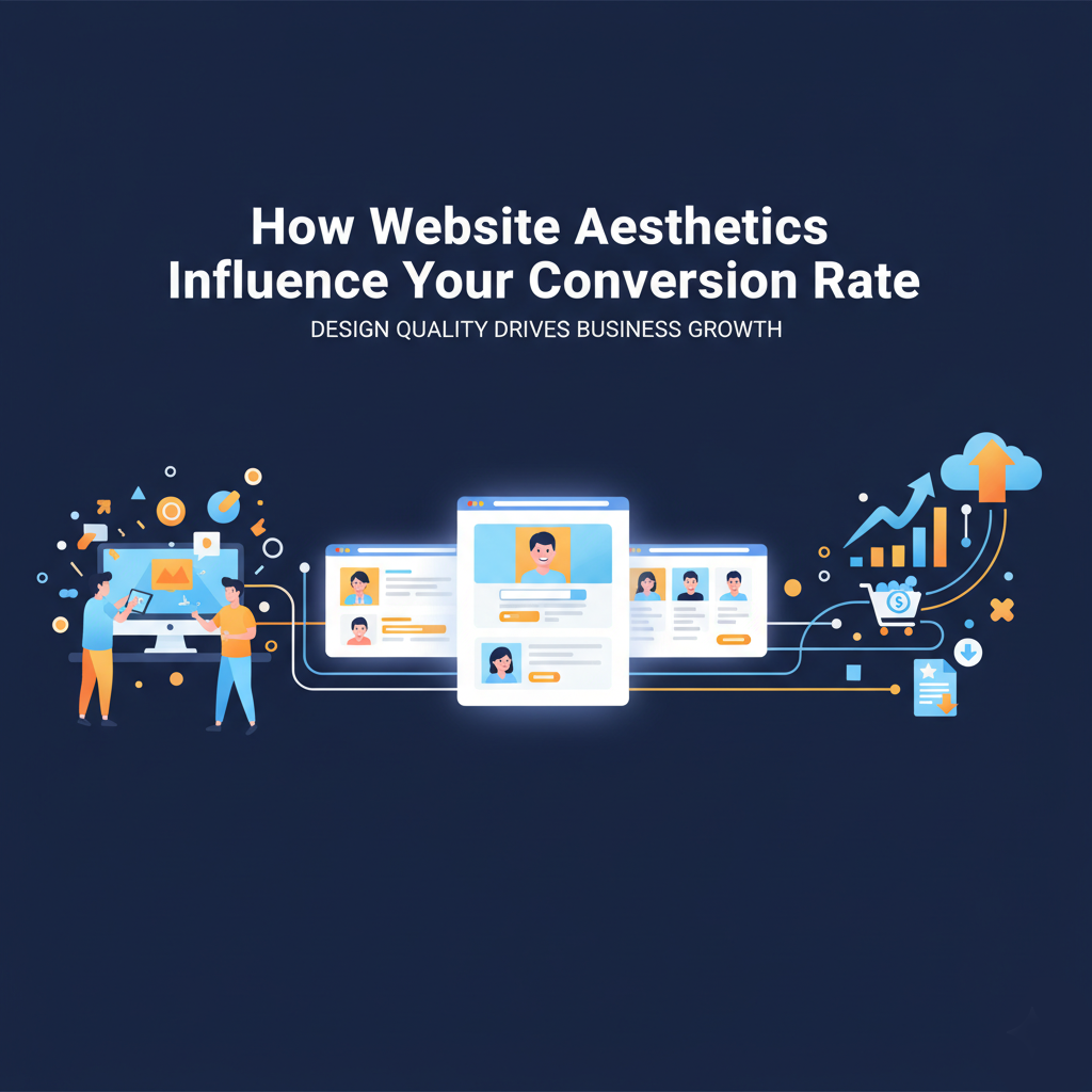
When someone lands on your website, they make a judgment in less than a second. And it is not about your pricing, not about your reviews but about your design. That instant reaction decides whether they stay or bounce.
And here’s what we at Oastreck have seen that a good design isn’t just about looking professional.
It is all about directly affecting your conversion rate and how much time users spend on your site and even your rankings on Google.
So come and join me as we break down how website aesthetics tie into trust, engagement and sales and how small design fixes can lift your conversions fast.
First Impressions Equals Ever Lasting Conversions
Now you could have the best services in your town but if your website looks really old and outdated then sorry your customers are rightfully gonna assume that your business is an old dump.
Yeah I know that is harsh but that is the truth that drives bounce rates up and studies have shown that users form opinions in under 0.05 seconds based purely on appearance.
And that can include color, layout, font and imagery which all of these combined send subconscious signals about your credibility.
So a clean and modern layout would say something like trustworthy professionals.
While a really cluttered mess and an inconsistent site make the visitor think that I might regret clicking this.
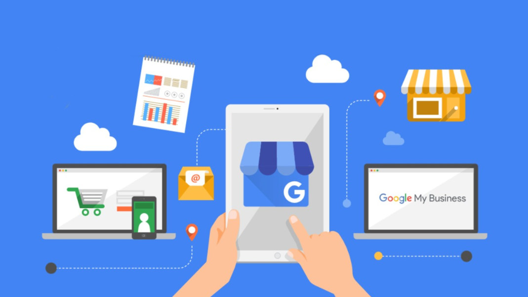
And that is why Oastreck website optimization always starts with design. So before you tweak your SEO or ads just do one thing and that is make sure that your site simply feels right.
Visual Design Builds Or Breaks Trust
In a grand world of digital marketing trust is the currency and visuals are your handshake.
Just think back to the last time you backed out of a website because it felt really sketchy maybe blurry images, strange colors or too much text.
You didn’t need proof it was unsafe because your brain had already decided no it wasn’t worth the risk.
And that is how most visitors react to poor design.
Because a well designed website for small businesses tells users that:
- You are a professional.
- You care about presentation.
- And you will probably handle their business with the same care.
As HubSpot’s web design research highlights visitors judge credibility mostly by visuals and not by content at first glance so you can read more about it Here.
Because good design doesn’t just look nice it creates confidence.
Colors, Fonts And Layouts Really Do Drive Action
There is a psychology behind color like for example:
- Blue builds trust and calm.
- Red creates urgency and drives action.
- White space helps the brain process content faster.
When a site overuses dark tones, small fonts or dense text it feels so cramped like a bad sales pitch.
But when spacing, colors and font weights are balanced then all of a sudden users can relax, read and decide.
Like that is the point where they click the Contact Us button.
And at Oastreck we call this visual the breathing room. A design that doesn’t shout but guides.
And if you want the best web design practices then Book a Schedule Now with Oastreck because it’s a good starting point for visual design and user trust.
Navigation Simplicity = Higher Conversions
If visitors have to hunt for your contact page or scroll endlessly to find what you do then sorry they won’t.
Because one of the biggest mistakes local business websites make is hiding those critical actions like Book Now, Call Today or Get a Quote under layers of design.
Like just try to be easy here because the simpler your navigation the higher your conversions.
Your visitors shouldn’t have to think about where to click next. It should feel natural, almost automatic.
Good UX design converts attention into action and that’s what Oastreck website design services specialize in.
And if your site looks all great but isn’t converting then I believe it is time to fix the hidden design flaws.
So get your Very Own Website Review with Oastreck Today because it is the best way to improve your website conversion rate.
How Mobile Design Impacts Buyer Trust
More than 65 percent of local service website traffic now comes from mobile users and worst of all is that many sites still look broken on phones with misaligned buttons, text cut off and slow loading speeds.
Like come on that frustration kills conversions really fast.
A mobile friendly website not only ranks better on Google but also increases your average session duration because users can scroll smoothly without zooming or pinching.
So if you are unsure how your site performs then check out Google’s free Mobile Friendly Test Tool.
Because mobile optimization isn’t optional anymore it’s how you stay competitive.
The Role That Rule Imagery And Authenticity
Stock photos scream fake all the time because customers can spot them instantly.
So instead use real images from your business like those of your team, your trucks and your workspaces because these small authentic touches make your brand feel human and credible.
At Oastreck we have seen local businesses increase conversions up to 40 percent just by replacing stock images with the authentic ones.
So if you want inspiration on brand driven visuals then make sure to check out Canva’s guide on visual consistency as it breaks down how to keep your images and colors aligned with your message.
Page Speed: The Silent Killer
It doesn’t matter how good your design looks because everything goes out of the window if it loads slowly.
Research by Google shows that 53 percent of mobile visitors leave sites that take more than 3 seconds to load.
And all of that is because high resolution images, bulky plugins and bad hosting just really want to ruin everyone’s day.
At Oastreck we compress, optimize and fine tune every element so your visitors don’t leave before seeing your content.
And if you want to test your current site then use PageSpeed Insights so you can get a good score and tips for further improvements.
The Subtle Art Of Consistency
Every color, line and heading should tell the same brand story. Like think about it this way if your homepage looks modern but your service pages feel old then customers sense that inconsistency and hesitate to go any further leaving you in a limbo.
It is like walking into a clean restaurant with a dirty menu. I mean it just doesn’t fit.
So if you don’t want that then Oastreck is here to help because our web design for small businesses focuses on brand consistency unified fonts, aligned visuals and balanced layouts that create harmony and trust.
Analytics Are The Key To What’s Working
If you are redesigning your site then please don’t guess what users want make sure to use that hard cold data to your benefit.
Tools like Hotjar or Google Analytics reveal which areas visitors click, scroll or abandon.
And at Oastreck we combine design insight with SEO analytics to create websites that not only look great but work hard behind the scenes.
Conclusion
Design isn’t decoration it is communication.
And when your website feels easy, professional and visually aligned it earns absolute trust and when trust builds so do those precious conversions.
So come on don’t treat your design as a side project treat it as your best salesperson.
And if you want your website to look good and convert better?
Then Join Oastreck’s Team and let our experts fine-tune your site for both beauty and performance.